A home office should feel like a space you actually want to spend time in, and paint color plays a huge role in that. The right shade can completely change the mood of the room, making it feel calmer, brighter, cozier, or even more motivating during a long workday.
If your office feels dull or distracting, sometimes a simple paint refresh is all it takes to make the space feel more inspiring and comfortable.
Certain colors naturally help with focus and productivity, while others create a softer, more relaxing atmosphere that keeps the room from feeling too serious or cold. Warm neutrals can make a workspace feel grounded and cozy, while cooler tones often feel fresh and clean.
The best part is that paint also helps tie everything together, from your desk and shelves to your lighting and decor. Whether your style leans modern, rustic, or minimal, choosing the right Sherwin-Williams color can make your home office feel polished, personal, and much more enjoyable to work in every day.
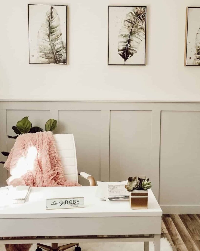
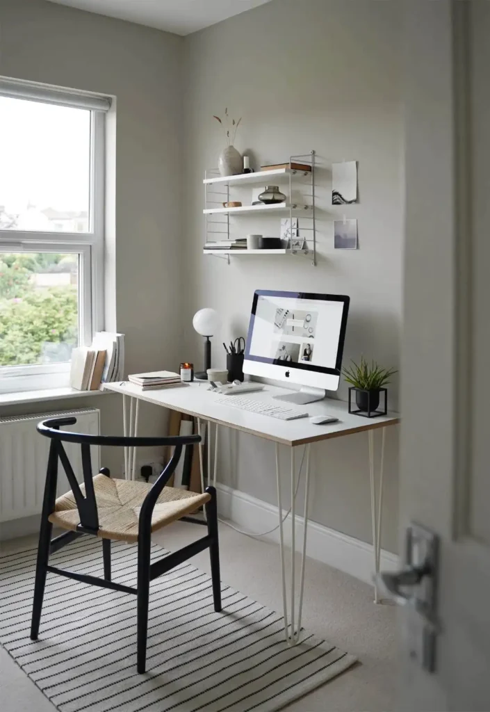
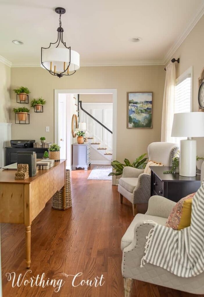
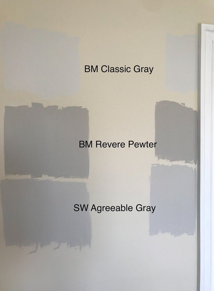
1. Agreeable Gray (SW 7029)
Agreeable Gray (SW 7029) is basically the friend that gets along with everyone. This soft warm gray works in almost any home office style, whether your space is modern, cozy, farmhouse-inspired, or somewhere between “Pinterest office” and “I just shoved a desk in the corner.” It has the perfect balance of warm and cool tones, so the room feels calm and inviting without looking dull.
One of the best things about Agreeable Gray is how effortlessly it works with other finishes. It looks gorgeous with wood desks, crisp white trim, black hardware, and even cozy textured decor like woven baskets or soft curtains. The color changes beautifully throughout the day too, feeling light and airy in natural sunlight while still staying warm and cozy at night.
It also creates the kind of atmosphere that helps you focus without making the room feel stiff or overly serious. The whole space ends up feeling polished, relaxed, and easy to spend hours in — which is exactly what you want in a home office.
2. Repose Gray (SW 7015)
If you love a calm, clutter-free workspace, Repose Gray might become your new favorite office color. This soft light gray has just enough cool undertone to feel fresh and modern without making the room feel cold or sterile. It’s one of those shades that quietly makes everything around it look more polished — your desk setup, floating shelves, even that random stack of notebooks suddenly feels intentional.
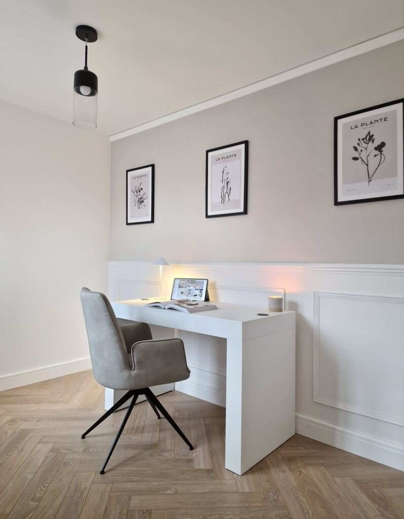
Repose Gray works especially well in minimalist home offices because it creates a clean backdrop that never feels distracting. Natural light makes it glow beautifully during the day, while lamps and warm lighting keep it cozy in the evening.

The best part? It helps bounce light around the room, so smaller offices feel more open and airy instead of cramped. Pair it with black accents, light wood furniture, or soft white trim for a space that feels peaceful, productive, and just a little bit Pinterest-worthy.
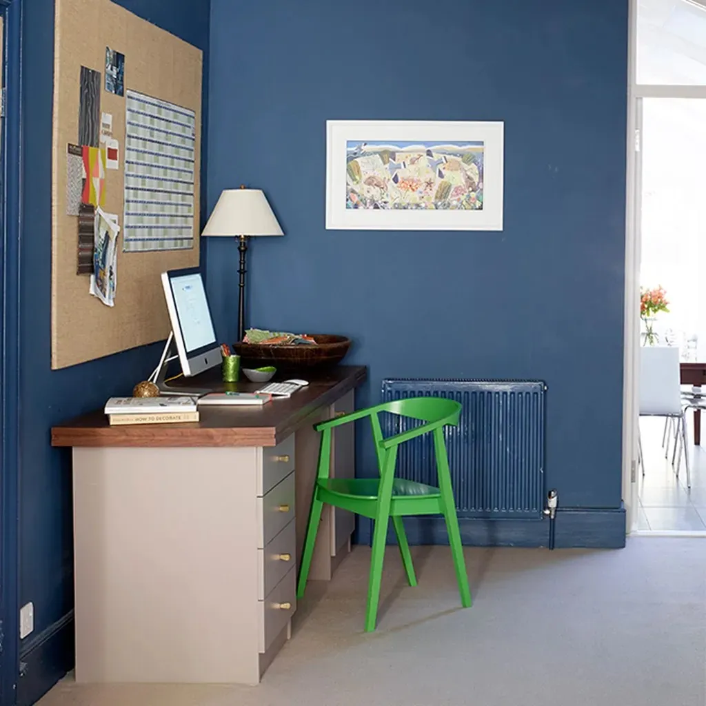
3. Naval (SW 6244)

Naval is for the person who wants their home office to feel a little dramatic in the best possible way. This deep navy blue instantly makes a workspace feel richer, moodier, and way more sophisticated — like the room belongs to someone who definitely answers emails with confidence.
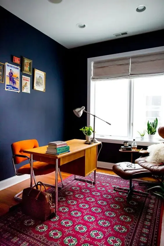
There’s something about Naval that helps a space feel focused and intentional. It wraps the room in this cozy, grounded atmosphere that’s perfect for deep work, creative brainstorming, or pretending you’re in a fancy executive office while wearing sweatpants. Pair it with warm lighting and the color becomes absolutely gorgeous. Brass lamps, gold accents, leather chairs, and warm wood tones all make the navy feel extra luxurious.
Even better, Naval creates amazing contrast with lighter furniture and shelves, so the whole room feels layered and designer-approved. It’s bold without feeling overwhelming — kind of like the paint color version of a really good espresso shot.
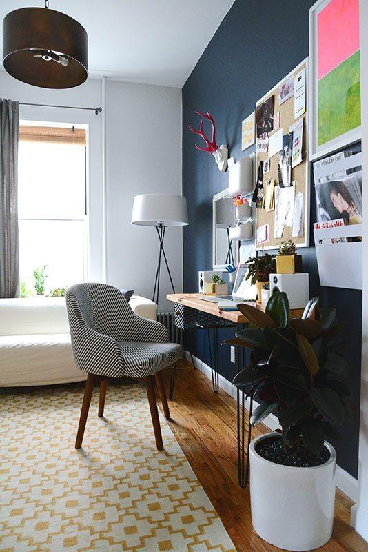
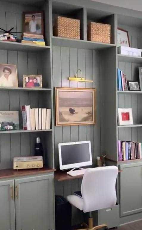
4. Evergreen Fog (SW 9130)
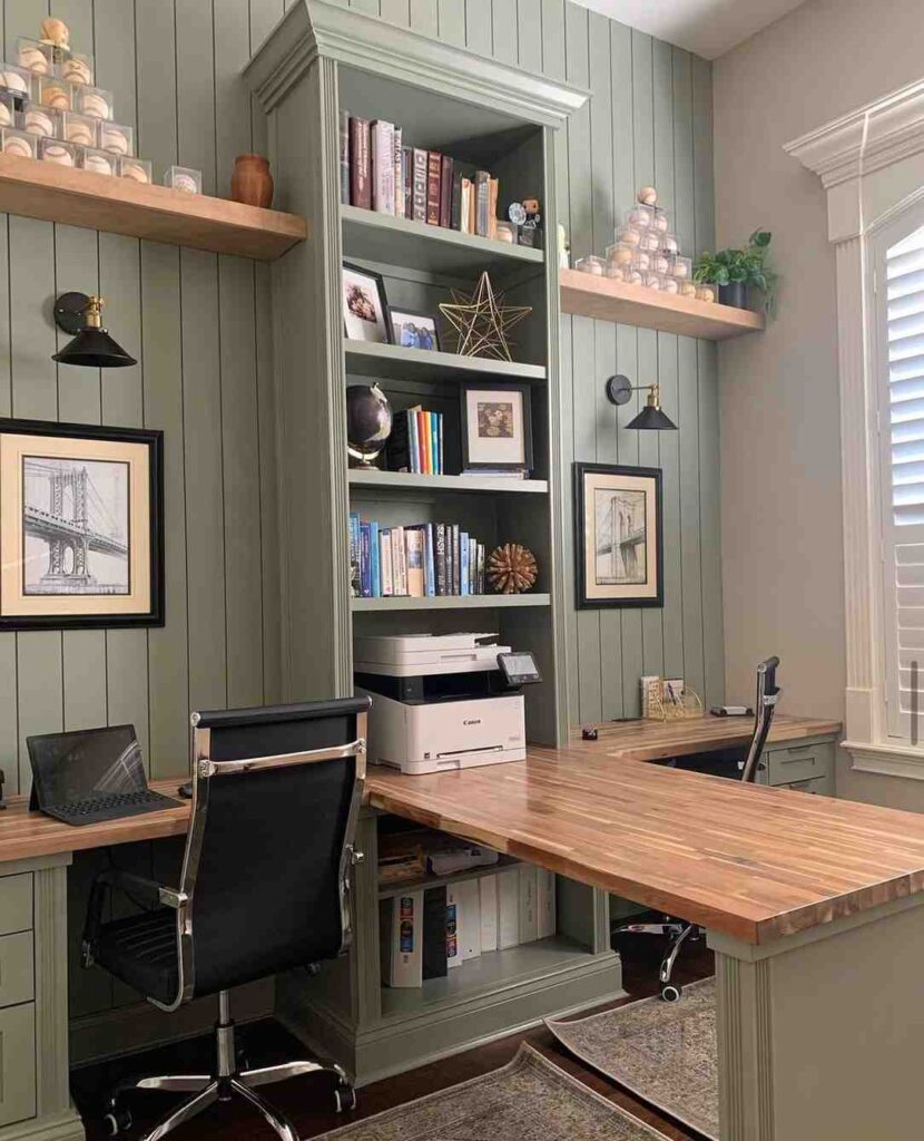
Evergreen Fog has that calm, quiet energy that makes a home office instantly feel more relaxing. It’s a muted green-gray that feels soft and earthy without being boring, and honestly, it’s the kind of color that makes you want to light a candle and actually answer your emails on time. During long workdays, the color helps the room feel less stressful and way more comfortable to sit in for hours.
This shade looks especially good with natural textures like warm wood desks, woven baskets, linen curtains, and plenty of plants. Even one little pothos in the corner suddenly looks designer-approved against this color. Evergreen Fog also changes beautifully throughout the day. In natural light, it feels airy and fresh, and by evening it gets a little moodier and cozier.
If you want your office to feel peaceful but still stylish, this color absolutely nails that balance without trying too hard.
5. Accessible Beige (SW 7036)
Accessible Beige is one of those colors that just makes a room feel comfortable right away. It’s warm, soft, and cozy without leaning too yellow or heavy, which is probably why so many people love using it in home offices. If your workspace doesn’t get much sunlight, this shade helps warm things up so the room still feels inviting instead of dark and gloomy.
What makes Accessible Beige so easy to love is how flexible it is. It works with modern decor, farmhouse touches, darker furniture, lighter woods — pretty much anything you already have in the room. It’s the kind of color that quietly makes everything look pulled together without stealing all the attention.
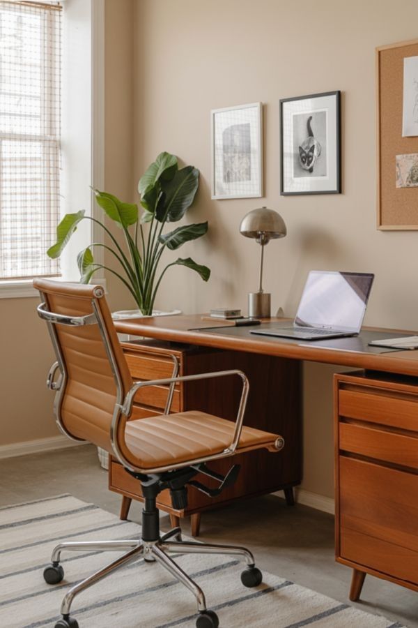
Add a warm desk lamp, a comfy chair, and maybe a soft throw blanket nearby, and suddenly the office feels less like a place you have to work and more like a space you actually want to spend time in.
Tips for Choosing the Right Home Office Paint Color
Picking the right home office paint color is a little like choosing the perfect coffee shop vibe — you want something that helps you feel focused, comfortable, and happy to spend hours there. One of the biggest things to think about is lighting. Natural light can completely change how a paint color looks throughout the day. A soft gray might feel bright and airy in the morning but moodier by evening, so always check how the color looks at different times before making a final decision.
It also helps to match the color to the way you work. If you like a calm, peaceful space, softer shades like green-grays and warm neutrals can help the room feel relaxing. If you want more energy or drama, deeper tones like navy can make the office feel rich and focused.
And please — never skip the sample paint step. Colors always look different on actual walls. A few test swatches can save you from a very expensive “what was I thinking?” moment later.
The right paint color can make a home office feel more comfortable, inspiring, and honestly a lot more enjoyable to spend time in. Whether you love the calm look of Repose Gray, the cozy warmth of Accessible Beige, the rich depth of Naval, or the relaxing vibe of Evergreen Fog, each shade brings its own personality into the space.
The best part is there’s no wrong choice — it’s all about creating a room that fits your style and helps you feel productive. A fresh coat of paint might seem simple, but it can completely change the way your workspace feels every single day.
Read Also: