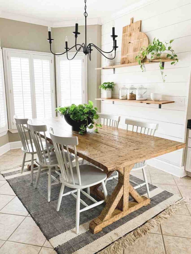
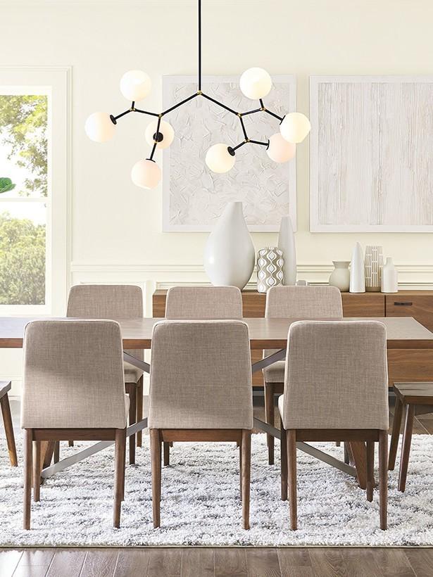
The dining room is one of those spaces where color really sets the mood. It’s where holiday dinners happen, where friends gather for long conversations, and where everyday meals can feel a little more special. The right paint color can completely change how the room feels.
Soft warm tones can make the space feel cozy and welcoming, while deeper shades can add elegance and drama. Even lighter neutrals can create that clean, airy look that makes a dining room feel relaxed but still polished.
When choosing a dining room color, it helps to think about the atmosphere you want to create. Do you want something formal and sophisticated? Warm and inviting? Bright and casual?
Lighting also plays a huge role, especially in dining rooms where evening lighting can make paint colors appear warmer and richer. A well-chosen shade ties everything together, from your dining table to your lighting fixtures, and makes the whole room feel intentional and comfortable.
1. Agreeable Gray (SW 7029)
If you want a dining room color that feels warm, timeless, and incredibly easy to decorate around, Agreeable Gray is one of the safest bets from Sherwin-Williams. It’s that perfect greige mix that doesn’t lean too cold or too beige, which makes it work beautifully in almost any dining room style. Whether your space is modern farmhouse, traditional, transitional, or even a little contemporary, this color blends right in without feeling boring.
One of the reasons designers love Agreeable Gray so much is how well it pairs with wood furniture. Dark walnut tables, medium oak finishes, and even lighter natural wood tones all look richer against this soft warm backdrop. It also works beautifully with black accents, brushed gold lighting, and crisp white trim if you want a more polished look.
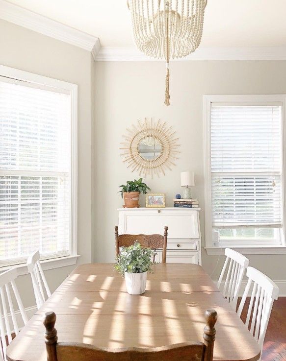
Another bonus is how cozy it feels at night. Under warm dining room lighting, Agreeable Gray takes on a soft, inviting warmth that makes the room feel comfortable and relaxed without looking too dark or heavy.
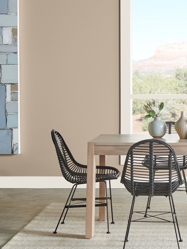
2. Accessible Beige (SW 7036)
Accessible Beige is one of those colors that instantly makes a dining room feel warm and comfortable without trying too hard. Even though it’s technically a beige, it has soft greige undertones that keep it from feeling too yellow or outdated. It’s subtle, relaxed, and incredibly easy to live with, especially if you want a dining room that feels calm and welcoming for everyday meals and entertaining.
This color really shines in rooms with a lot of natural light. During the day, the warm undertones give the walls a soft glow that feels cozy but still airy. It works beautifully with wood dining tables, woven textures, linen curtains, and warm metallic finishes if you want that effortless designer look.
I also love Accessible Beige because it creates a nice neutral backdrop without feeling plain. It adds warmth to the space while still letting your furniture, lighting, and decor stand out naturally.
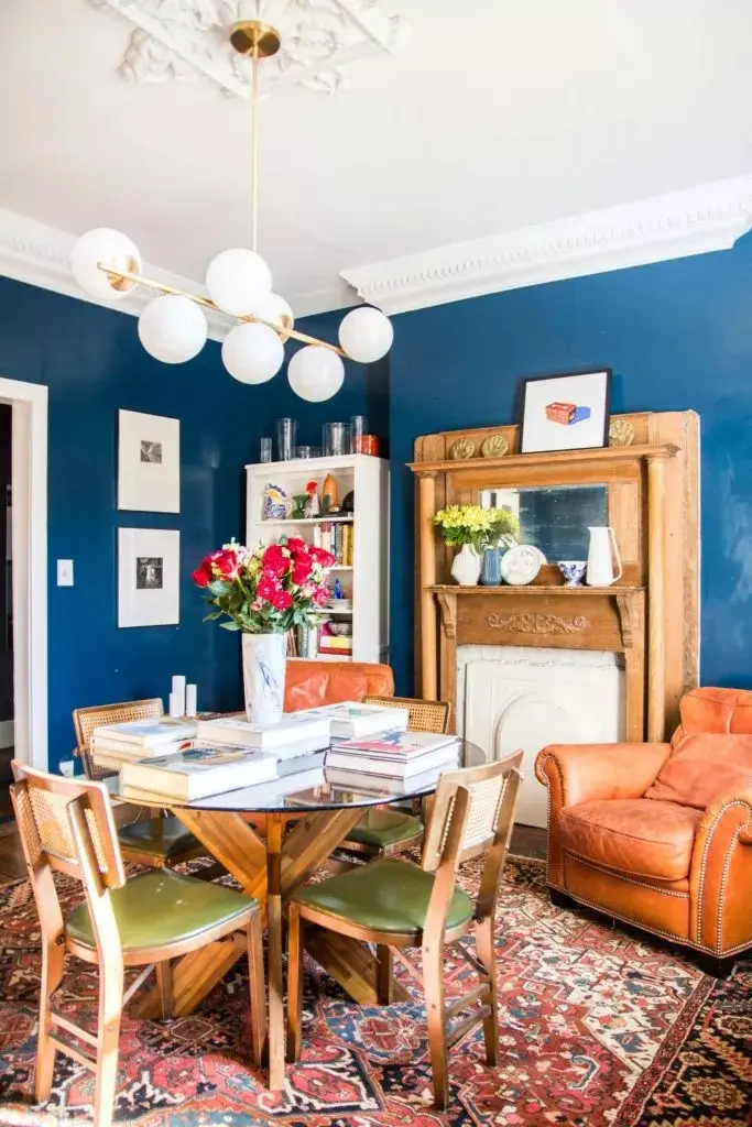
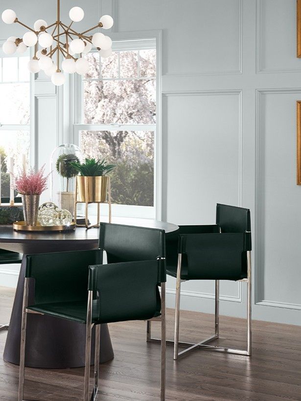
3. Naval (SW 6244)
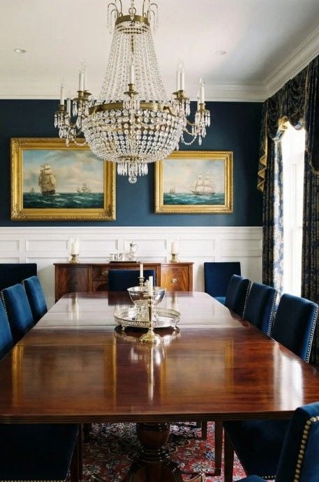
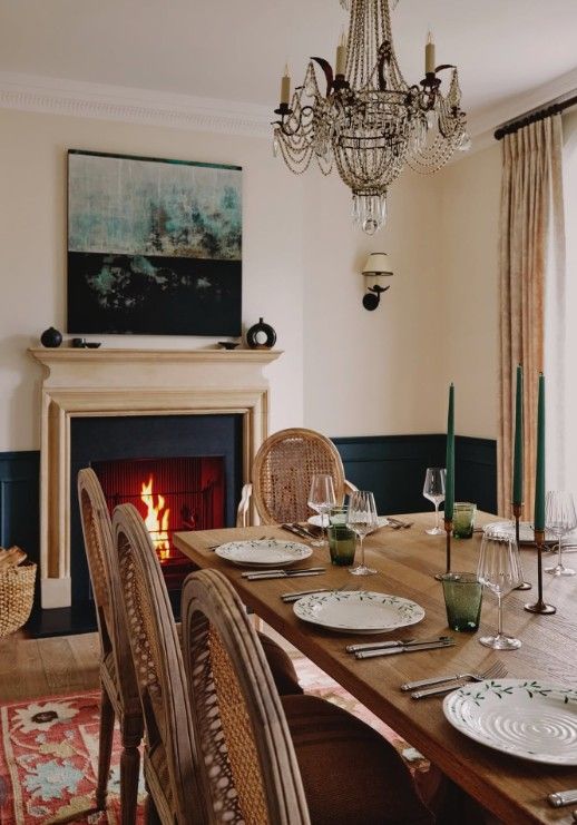
If you want your dining room to feel bold, elegant, and a little dramatic, Naval is such a stunning choice. This rich navy blue instantly adds depth and sophistication to the space without feeling overly trendy. It has a classic quality to it that works beautifully in both modern and traditional homes, especially if you want the dining room to feel a little more elevated and formal.
One of the best things about Naval is the contrast it creates. Against crisp white trim, the deep blue looks clean and striking, while gold accents add warmth and a touch of luxury. Think gold light fixtures, brass candle holders, or even a gold-framed mirror to make the color really pop.
Because it’s a darker shade, Naval works especially well in dining rooms where you want a cozy evening atmosphere. It feels intimate and inviting at night, especially under warm lighting, making dinners and gatherings feel a little more special and memorable.
4. Alabaster (SW 7008)
Alabaster is one of those paint colors that designers keep coming back to because it simply works everywhere. This soft warm white has just enough warmth to keep a dining room from feeling cold or sterile, which is something that can happen with brighter whites. Instead, Alabaster feels cozy, clean, and welcoming all at the same time.
It’s an especially great choice for smaller dining rooms because it helps bounce light around the space and makes the room feel more open and airy. If your dining room doesn’t get a ton of natural light, this color can really help brighten things up without looking harsh.
Another reason people love Alabaster is how versatile it is. It works beautifully with almost any style, whether your dining room leans modern, farmhouse, coastal, or traditional. Pair it with wood furniture, black accents, or soft neutral decor, and it instantly creates that timeless, effortlessly polished look that never feels trendy or overdone.
5. Evergreen Fog (SW 9130)
Evergreen Fog is such a beautiful choice if you want a dining room that feels calm, grounded, and a little more unique than the usual neutral colors. This soft green-gray shade has a muted, earthy quality that instantly creates a relaxed atmosphere without feeling too dark or overpowering. It’s subtle enough to feel timeless but still adds personality to the space.
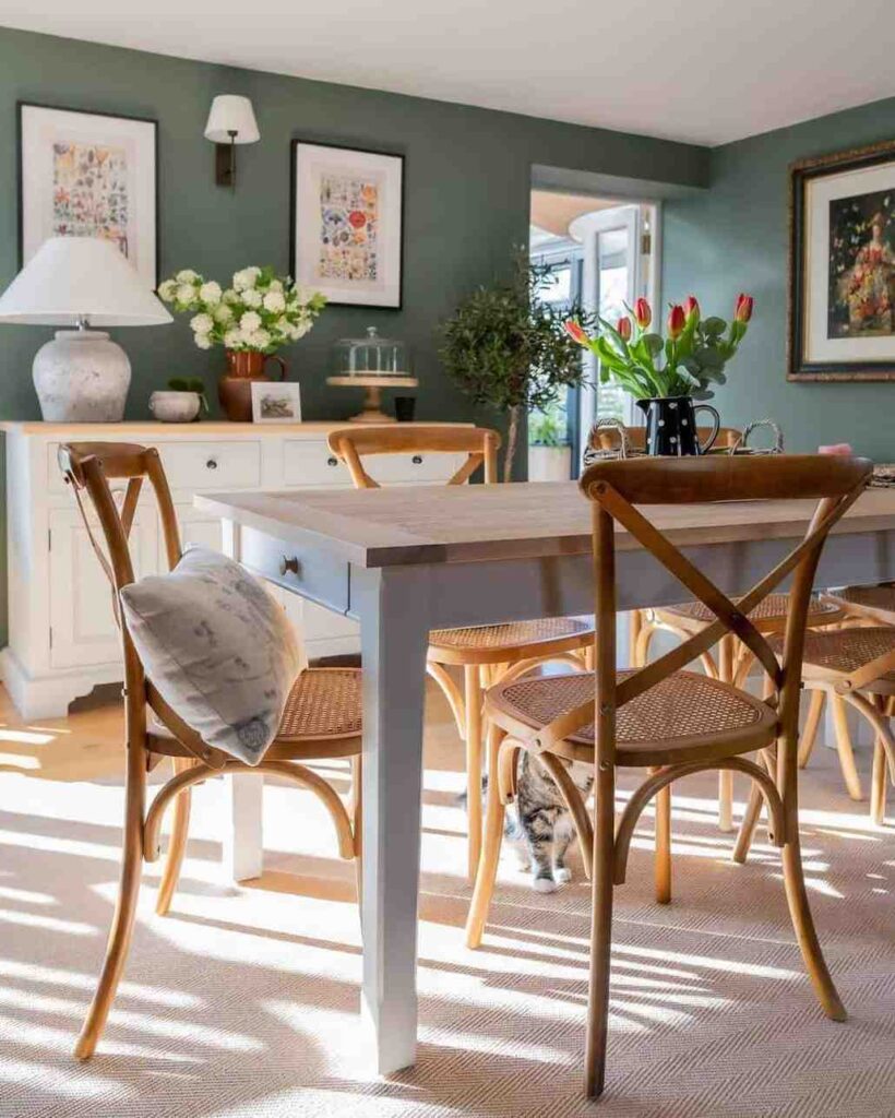
What makes Evergreen Fog really stand out is how well it works with natural textures and organic decor. Think wood dining tables, woven chairs, linen curtains, ceramic vases, and warm metallic finishes. The color brings out those natural elements beautifully and gives the whole room a soft, designer-inspired feel.
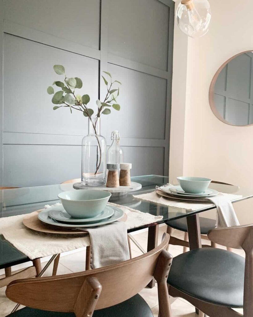
I especially love this shade for dining rooms because it feels peaceful during the day and cozy at night. It has that perfect balance of warmth and softness that makes people want to sit, relax, and stay awhile after dinner instead of rushing out of the room.
Tips for Choosing Dining Room Paint Colors
Choosing the right dining room paint color becomes so much easier when you pay attention to the room’s lighting and size first. Natural light can completely change how a color looks throughout the day. A shade that feels soft and warm in the morning might look darker or cooler at night under artificial lighting. If your dining room is small or doesn’t get much sunlight, lighter colors like Alabaster or Accessible Beige can help the space feel brighter and more open.
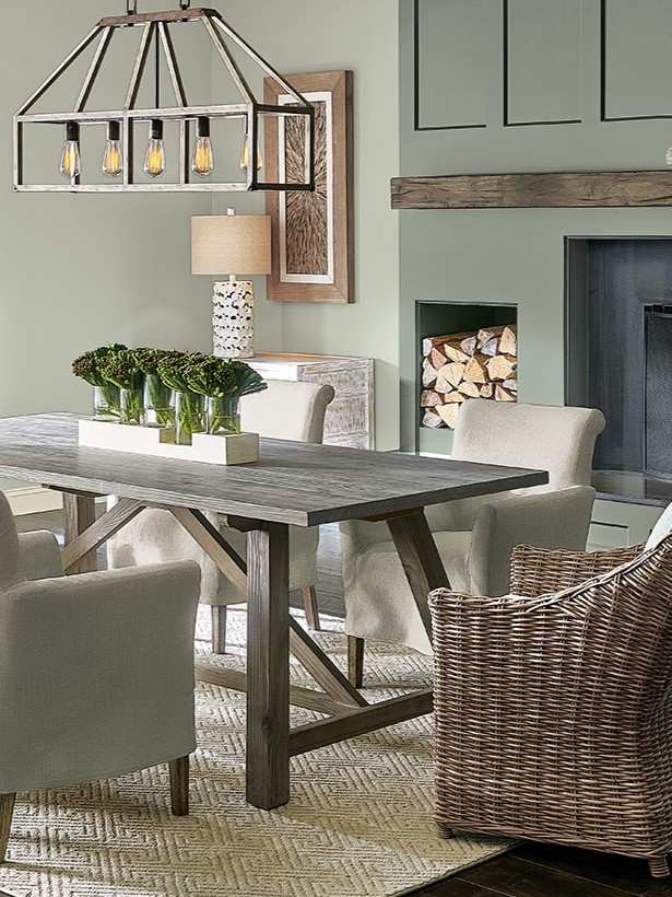
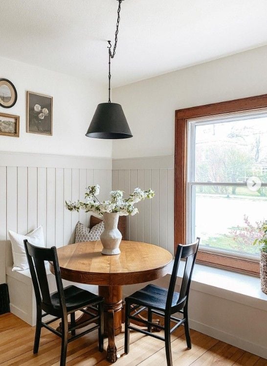
It also helps to think about your furniture and flooring before picking a paint color. You want the walls to complement those existing tones instead of fighting against them. Warm wood furniture usually pairs beautifully with warm neutrals, while darker furniture can look stunning against richer shades like Naval or Evergreen Fog.
And honestly, always test samples first. Paint colors almost never look exactly the same on a tiny swatch as they do on an entire wall. Trying a few samples in different lighting conditions can save you from making an expensive mistake later.
Finding the right dining room paint color can completely change how the space feels. Warm neutrals like Agreeable Gray, Accessible Beige, and Alabaster create a cozy and welcoming atmosphere, while deeper shades like Naval add drama and elegance. If you want something calm and earthy, Evergreen Fog is a beautiful option that feels relaxed and modern at the same time.
The best part about these Sherwin-Williams colors is how versatile they are with different furniture styles, lighting, and decor. Choose a shade that matches the mood you want to create, and your dining room will instantly feel more inviting and beautifully put together.
Read Also: