Kitchen paint color can completely change how the space feels. The right shade can make a kitchen look brighter, cleaner, and more inviting without changing anything else in the room.
I always recommend choosing colors that reflect light well and work with your cabinets, countertops, and flooring because kitchens are one of the busiest spaces in the home.
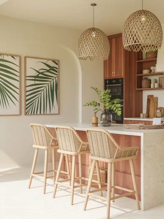
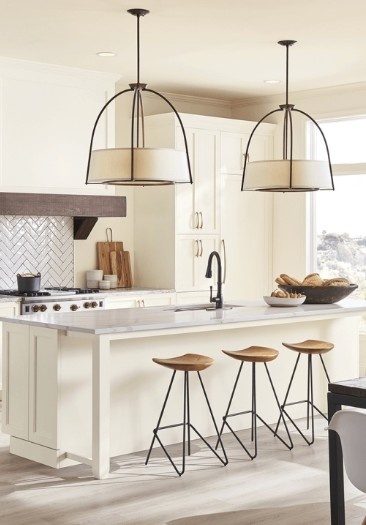
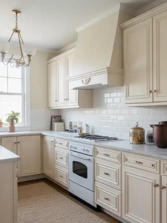
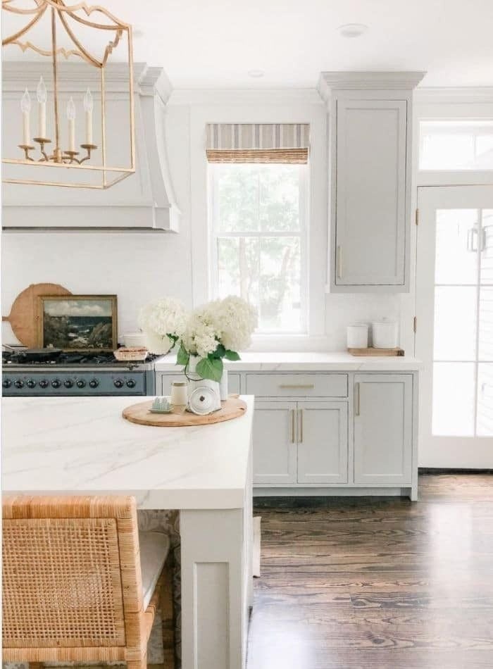
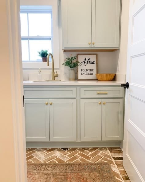
Soft whites, warm neutrals, and muted greens are especially popular because they create a fresh and comfortable atmosphere. That’s one reason homeowners love Sherwin-Williams paints. Their colors are reliable, easy to coordinate, and available in shades that work beautifully in almost any kitchen style.
How to Choose the Right Kitchen Paint Color
Choosing the right kitchen paint color starts with paying attention to lighting. Natural light makes colors appear brighter and softer during the day, while artificial lighting can bring out stronger yellow, gray, or even green undertones at night. I always tell homeowners to test paint samples on multiple walls before committing because the color can shift a lot throughout the day.
A warm white may look creamy in morning sunlight but slightly beige under warm pendant lighting at night. That’s especially important with Sherwin-Williams colors because many of their popular shades have subtle undertones that become more noticeable depending on the lighting.
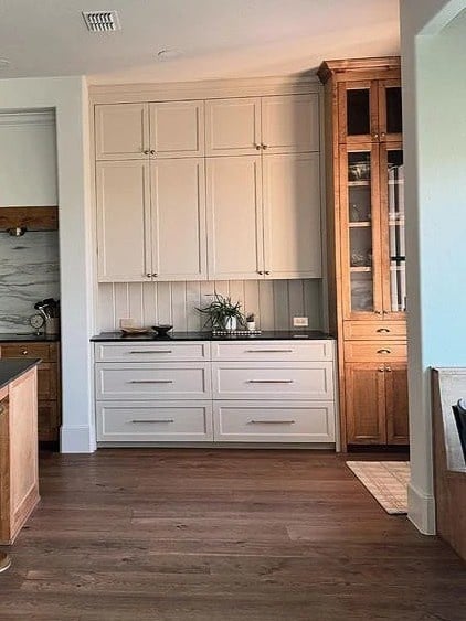
You’ll also want to think about your cabinets and countertops before choosing a wall color. Warm-toned wood cabinets usually pair best with creamy whites, greiges, or soft taupes, while cooler countertops like marble or quartz often look better with crisp whites or muted blue-grays. The goal is to create contrast without making the finishes compete with each other.
Kitchen size matters too. Light paint colors can help smaller kitchens feel more open and airy, while larger kitchens can handle medium or even deeper shades without feeling closed in. Darker colors often add warmth and personality to spacious kitchens that otherwise feel a little empty.
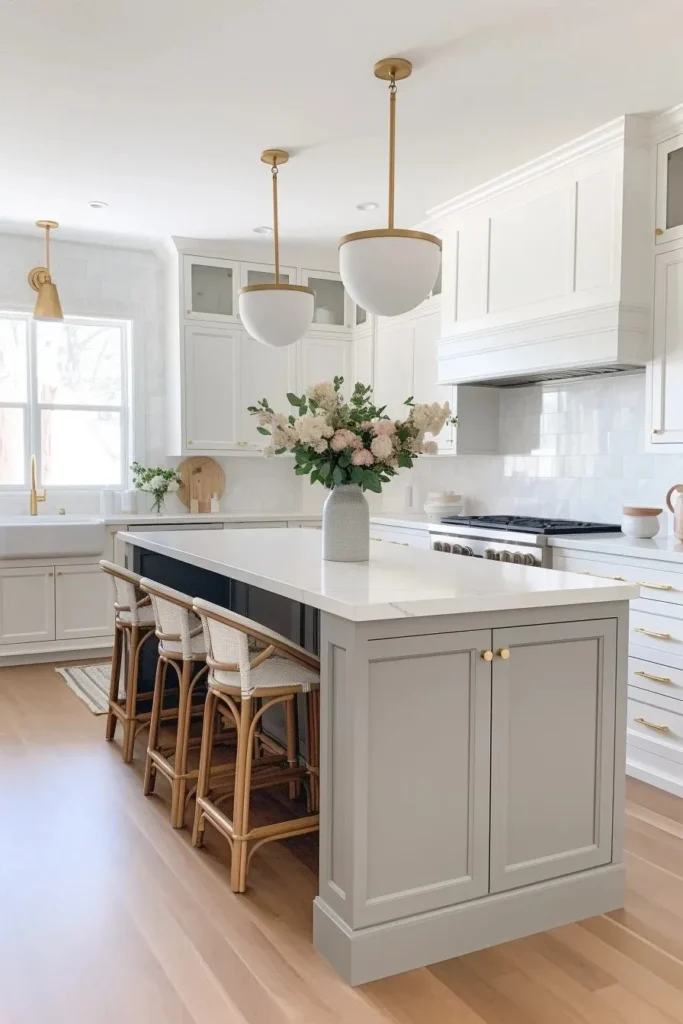
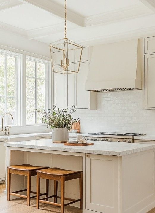
1. Alabaster (SW 7008)
If you want a kitchen color that always feels fresh, bright, and easy to live with, Alabaster is one of those shades I recommend over and over again. It’s a soft warm white that doesn’t feel stark or cold, which makes a huge difference in kitchens where you spend a lot of time. Some whites can look too clinical under bright lighting, but Alabaster has this creamy warmth that instantly makes the space feel more welcoming.
I especially love it in kitchens with natural wood accents because it softens the contrast and lets the wood tones stand out beautifully. It also looks incredibly clean with white cabinets if you want that timeless layered-white look that never really goes out of style.
In smaller kitchens, Alabaster can help bounce light around and make the room feel more open without feeling overly bright. It’s one of those safe-but-beautiful colors that works with almost any design style.
2. Repose Gray (SW 7015)
Repose Gray is one of my favorite “easy” kitchen colors because it sits right in that sweet spot between gray and beige. It has a subtle warmth that keeps it from feeling flat, so the kitchen still feels cozy and inviting instead of cold and overly modern. If you like clean, updated spaces but still want some softness, this color does that really well.
I usually recommend Repose Gray for modern or transitional kitchens because it pairs effortlessly with so many finishes. Stainless steel appliances look especially sharp against it, and it also works beautifully with white cabinets, black hardware, and marble-style countertops.
Depending on the lighting, it can lean slightly warmer or cooler throughout the day, which gives the kitchen a more layered and natural feel. It’s also incredibly forgiving, so it hides everyday wear better than a crisp white. If you want a neutral that feels polished without trying too hard, Repose Gray is a really solid choice.
3. Sea Salt (SW 6204)
Sea Salt is one of those colors that instantly changes the mood of a kitchen in the best way. It’s a soft blue-green neutral that feels light, relaxed, and airy without being too colorful. I always recommend it for anyone who wants their kitchen to feel calm and welcoming instead of overly stark or trendy. Depending on the lighting, it can lean a little more green or slightly blue, which gives it that soft, layered look that feels really natural.
This shade works especially well in coastal and farmhouse kitchens because it pairs beautifully with white cabinets, natural wood tones, woven textures, and brushed nickel hardware. I also love it with open shelving and warm wood floors because it creates that easy lived-in look people are always trying to achieve.
In kitchens with lots of natural light, Sea Salt feels fresh and breezy all day long. It’s subtle enough to stay timeless but still adds more personality than a typical neutral.
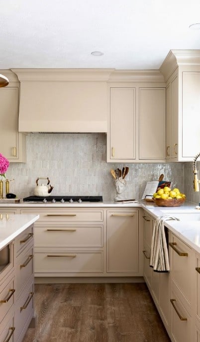
4. Accessible Beige (SW 7036)
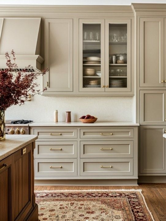
Accessible Beige is one of my go-to recommendations when someone wants warmth in the kitchen but doesn’t want the walls to feel too yellow or heavy. It’s a warm neutral beige with a soft greige undertone, so it feels updated and versatile instead of dated. That balance is what makes it so easy to work with in real homes.
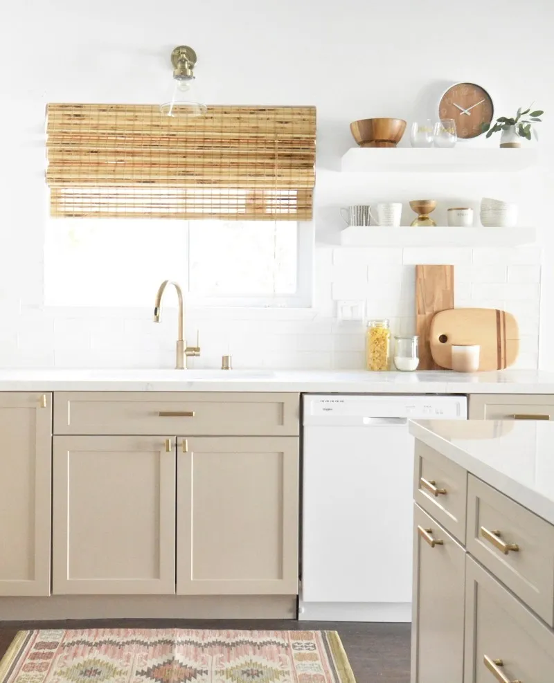
I love using this color in kitchens with earthy finishes because it complements wood cabinets, warm stone countertops, terracotta accents, and matte black hardware really beautifully. It also looks great with creamy white trim if you want the space to feel soft and layered rather than super high-contrast.
One thing I really like about Accessible Beige is how comfortable it makes a kitchen feel. It has that cozy warmth that makes the room more inviting without making it feel dark. If your kitchen gets cooler light or feels a little sterile, this color can instantly warm everything up in a very natural way.
5. Iron Ore (SW 7069)
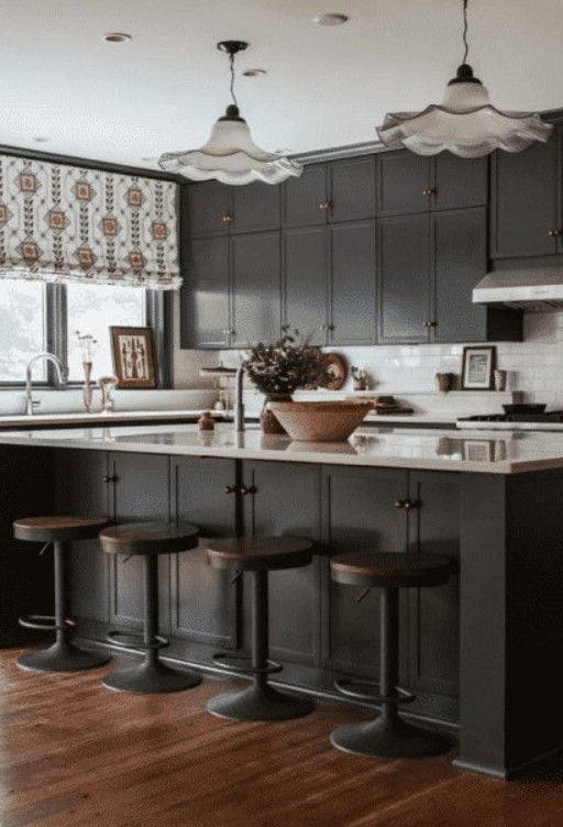
Iron Ore is one of those paint colors that can completely transform a kitchen without needing a full remodel. It’s a deep charcoal black, but it feels softer and more livable than a true jet black. I love recommending it for kitchen islands because it creates instant contrast and gives the space that custom designer look people always notice. If you have white or light cabinets, Iron Ore adds depth and makes everything around it feel more polished and intentional.
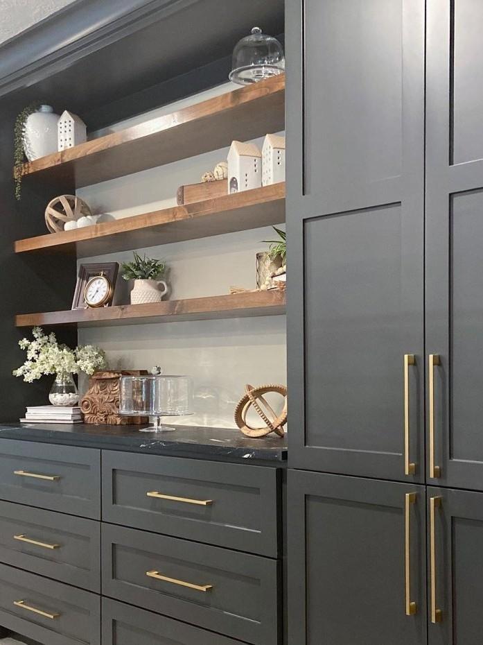
It also works beautifully on accent walls, pantry doors, or lower cabinets if you want something bold without overwhelming the whole kitchen. What I really like about this shade is that it feels dramatic while still staying warm and sophisticated.
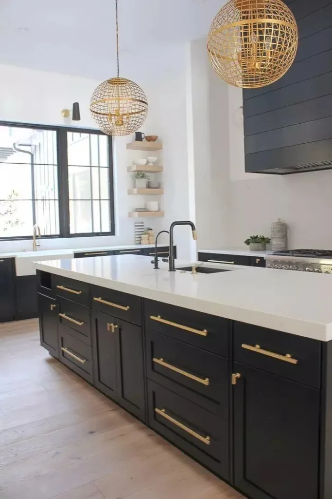
Pair it with brass hardware for a richer look or stainless steel finishes for something cleaner and more modern. In kitchens with good lighting, Iron Ore creates that cozy, high-end feel that makes the entire space look more expensive.
Tips for Choosing the Right Finish
When choosing kitchen paint, the finish matters just as much as the color. I usually recommend satin or semi-gloss because kitchens deal with a lot of moisture, grease, fingerprints, and everyday messes. A flat finish may look pretty at first, but it’s much harder to clean and doesn’t hold up as well over time.
Satin is a great middle ground if you want a softer look. It has a slight sheen that reflects light nicely without feeling too shiny, so it works well for most kitchen walls. Semi-gloss, on the other hand, is more durable and easier to wipe down, which makes it perfect for cabinets, trim, and high-traffic areas.
If you cook often or have kids around, having a washable finish really makes life easier. You’ll be able to clean splatters and smudges without worrying about damaging the paint, and the kitchen will stay looking fresh much longer.
Common Kitchen Paint Mistakes to Avoid
One of the biggest mistakes I see people make in kitchens is ignoring undertones. A paint color might look perfect online or in the store, then suddenly look pink, green, or icy blue once it’s on the wall. That’s why lighting matters so much. Natural light, cabinet colors, countertops, and even flooring can completely change how a paint color reads in the space.
Another common issue is choosing colors that are too dark for the amount of light the kitchen gets. Dark colors can look beautiful, but in kitchens with limited natural light, they can sometimes make the room feel smaller and heavier than expected. Balance is key.
I also recommend avoiding too many competing tones in one kitchen. Warm cabinets, cool gray walls, and bright white countertops can sometimes fight against each other visually. Try to keep the undertones connected so the whole room feels cohesive. A kitchen usually looks best when the colors flow naturally together instead of competing for attention.
The best kitchen paint colors should make your space feel warm, inviting, and easy to live in every day. Whether you love bright whites, soft neutrals, calming greens, or dramatic dark tones, always test samples before painting. The right color can completely transform your kitchen and make it feel more stylish, comfortable, and welcoming.
Read Also: