In a small bathroom, paint color does more than decorate—it shapes how the space feels. The right shade can reflect light, soften edges, and make everything look brighter, cleaner, and more open without changing the layout.
I usually recommend Sherwin-Williams because their colors are consistent and easy to work with. I’ll walk you through five shades that reliably make compact bathrooms feel calm, airy, and put together.
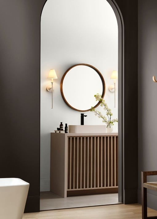
Choosing the Right Paint Color for a Small Bathroom
Start with lighting, because it changes everything. Natural light shifts throughout the day, while artificial bulbs can make colors look warmer or cooler, so always test samples on your wall. If your bathroom has little to no natural light, your bulbs will heavily influence how the color shows up, so it’s worth checking it at different times.
Lighter, airy tones help reflect light and visually expand the space, making it feel less cramped. Choose a satin or semi-gloss finish to add durability and a subtle sheen that bounces light around. Finally, keep your palette cohesive—stick to similar tones so the room feels smooth, uncluttered, and more spacious overall.
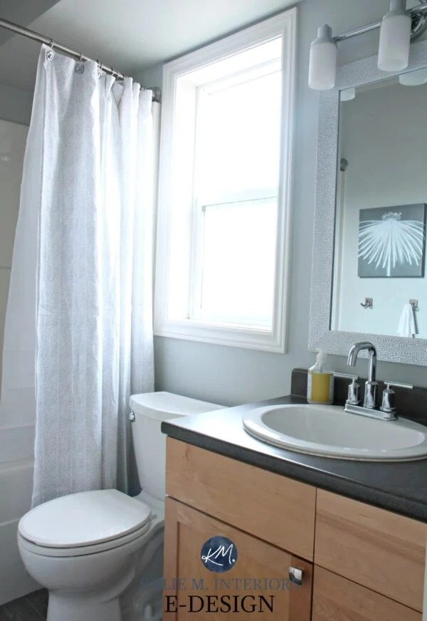
1. Sherwin-Williams Alabaster (SW 7008)
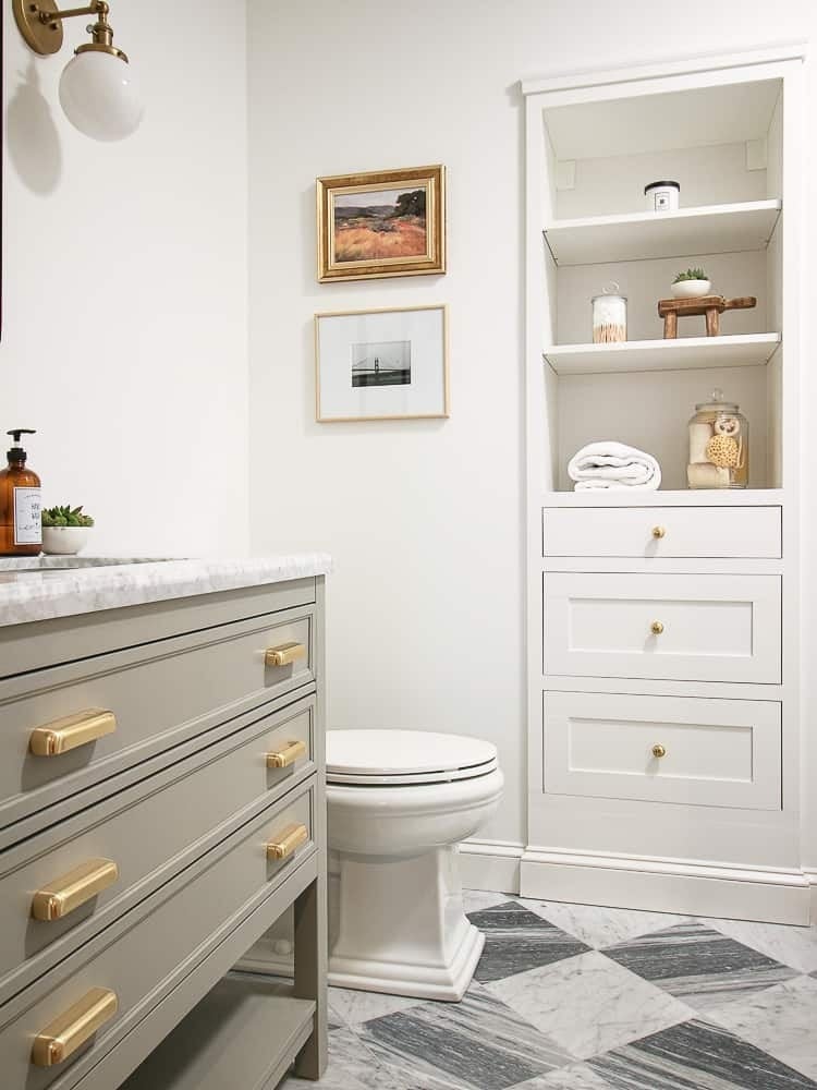
If you ask me for a “safe but beautiful” white, I’ll almost always point you to Sherwin-Williams Alabaster (SW 7008). It’s that soft warm white that feels clean without being stark or clinical. There’s a subtle creaminess to it, which makes the whole room feel more relaxed—like a space you actually want to spend time in, not just rush through.
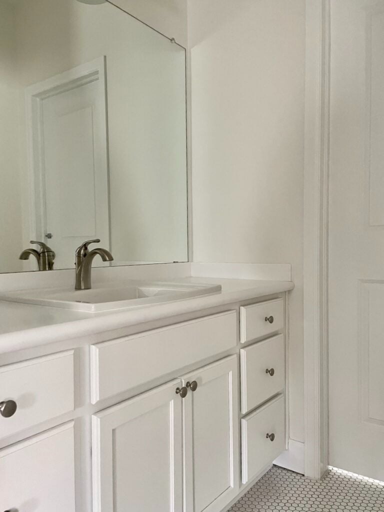
In a small bathroom, this color really pulls its weight. It reflects light really well, so even tight spaces instantly feel brighter and more open. But unlike cooler whites, it doesn’t bounce light in a harsh way. It softens everything—shadows, corners, even the look of your fixtures—so the whole space feels more forgiving and cohesive.
For pairings, I’d go warm and layered. Brushed brass or gold fixtures look gorgeous against Alabaster, especially if you want a slightly elevated feel. Matte black works too if you want contrast. For tiles, you can’t go wrong with classic white subway, but if you want more personality, try textured tiles or soft marble veining. Add in light wood accents—like a vanity or stool—and suddenly the space feels warm and grounded.
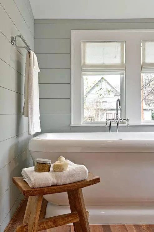
2. Sherwin-Williams Sea Salt (SW 6204)
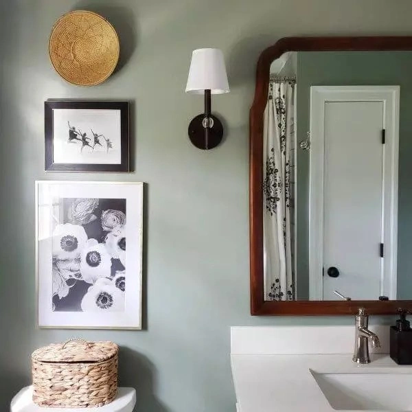
If Alabaster is your safe neutral, then Sherwin-Williams Sea Salt (SW 6204) is your calm, personality-filled upgrade. It’s this soft green-blue that shifts depending on the light, which makes it feel a little more dynamic without being overwhelming. Think fresh, airy, and slightly coastal—but still subtle.
What I love about Sea Salt is how easily it creates that spa-like feel. The color naturally relaxes the space, so even a small bathroom starts to feel like a little retreat. It’s not loud, it’s not trendy in a risky way—it just quietly makes everything feel more peaceful.
It works especially well if you get natural light. Sunlight tends to pull out the green undertones, giving the room a fresh, almost organic vibe. In lower light, it leans a bit more muted and blue-gray, which still feels soft and calming rather than dull. So it adapts really nicely no matter your setup.
For decor, I’d keep things light and natural. White or off-white tiles help keep it crisp, while light wood adds warmth so it doesn’t feel cold. Woven baskets, simple greenery, and soft textiles really bring it together. For fixtures, chrome or brushed nickel keeps it clean, while warmer metals add a nice contrast. It’s an easy way to make your bathroom feel styled without overthinking it.
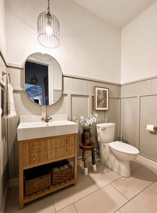
3. Sherwin-Williams Agreeable Gray (SW 7029)
If you’re stuck choosing between gray and beige, Sherwin-Williams Agreeable Gray (SW 7029) is honestly the easiest “just go with this” option. It’s that perfect warm greige—so you get the softness of beige with the clean look of gray, without tipping too far in either direction. It feels balanced, which is exactly what you want in a bathroom you’ll use every day.
What I love about it is that it never feels cold. Some grays can make a small bathroom look a bit flat or lifeless, but Agreeable Gray has enough warmth to keep things inviting. It works especially well if your space doesn’t get a ton of natural light—it won’t turn gloomy on you.
Style-wise, it’s super versatile. You can go modern with sleek fixtures and clean lines, or lean more classic with traditional vanities and softer details—it handles both effortlessly. For pairings, I’d keep things layered: white or marble-look tiles for brightness, matte black or brushed nickel fixtures for contrast, and maybe a wood vanity to warm everything up. Add a simple mirror with a thin frame and you’ve got a space that feels polished but still relaxed.
4. Sherwin-Williams Pure White (SW 7005)
If you’re going for that clean, minimalist look, Sherwin-Williams Pure White (SW 7005) is a really solid choice. It’s a crisp white, but not overly blue or harsh, so it still feels approachable. Think fresh, bright, and simple—like a blank canvas that makes everything else pop.
In a small bathroom, this color is a game changer. It reflects light really well, so the whole space instantly feels bigger and more open. If you have limited square footage, this is one of the easiest ways to visually expand the room without changing anything structurally.
That said, with a clean white like this, you do want to be intentional so it doesn’t feel too sterile. I’d bring in contrast and texture. Matte black fixtures are a classic choice—they add definition and keep things from feeling flat. If you want something softer, brushed brass or warm metals can add a bit of warmth.
You can also layer in natural elements—wood accents, woven baskets, even a small plant—to make the space feel more lived-in. Textured towels, a subtle patterned tile, or a framed mirror can go a long way too. The goal is to keep that clean look, but still make it feel like you, not a showroom.
5. Sherwin-Williams Rainwashed (SW 6211)
If you want a hint of color without committing to something bold, Sherwin-Williams Rainwashed (SW 6211) is such a calming pick. It sits right in that soft blue-green zone—fresh, airy, and just a little bit coastal without feeling themed. It’s one of those colors that makes a space feel lighter the second it goes on the wall.
What makes Rainwashed great for small bathrooms is how gentle it is. It adds personality, but it doesn’t close the space in or feel heavy. Instead, it kind of lifts the room and gives it that relaxed, spa-like energy—like you’re stepping into a quiet retreat instead of a cramped bathroom.
For styling, I’d keep everything feeling light and natural. White or off-white tiles help balance the color and keep things bright. Light wood tones—like a vanity or even small accessories—add warmth and stop it from feeling too cool. You can also layer in simple textures like woven baskets, soft towels, and maybe a small plant to bring in that fresh vibe. For fixtures, chrome or brushed nickel keeps it clean, while softer gold tones can warm it up if you want a bit more contrast.
Tips to Make a Small Bathroom Look Bigger with the Right Paint Color
When space is tight, paint can really do the heavy lifting. I usually recommend sticking to a monochromatic palette—it keeps everything feeling seamless and less visually “busy.” Try using the same color on your walls and ceiling; it blurs edges and makes the room feel taller instantly. You can also play with subtle vertical or horizontal tricks, like soft stripes or paneling, to guide the eye. One more thing—keep your trim the same color as your walls. That contrast break might seem small, but removing it helps the whole room feel more open and cohesive.
Common Mistakes to Avoid
A few small missteps can make a bathroom feel even tighter than it is. Dark colors aren’t off-limits, but using them without enough light can close the space in quickly. Undertones matter more than people think—what looks like a soft gray might lean green or purple once it’s on your walls. Finish is another big one; overly glossy paint can highlight imperfections, while too-flat finishes may look dull. Try a soft satin or eggshell instead. And honestly, don’t overcomplicate things—too many colors or contrasts can make a small space feel cluttered instead of calm.
If you’re choosing from Sherwin-Williams, you really can’t go wrong with soft, airy shades like Snowbound, Alabaster, Sea Salt, Rainwashed, or Light French Gray. Each one has a way of opening up a space while still adding personality.
Paint isn’t just about color—it shapes how a room feels, whether that’s bright and fresh or calm and spa-like. Before committing, always test a few samples on your walls and check them at different times of day. Lighting changes everything, and seeing it in your actual space makes all the difference.
Read Also: