Choosing paint for a master bath can feel weirdly stressful, right? It’s not just a bathroom—you’re in there every morning, every night, and you want it to feel calm, clean, and maybe a little luxurious too.
As a designer, I always tell friends that the right paint color does more than look pretty—it sets the entire mood of the space. Whether you’re dreaming of a spa-like retreat, something warm and timeless, or a slightly moody vibe, these best Sherwin Williams paint colors for a master bath are tried-and-true favorites that make bathrooms feel beautiful, comfortable, and easy to live with.
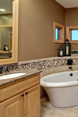
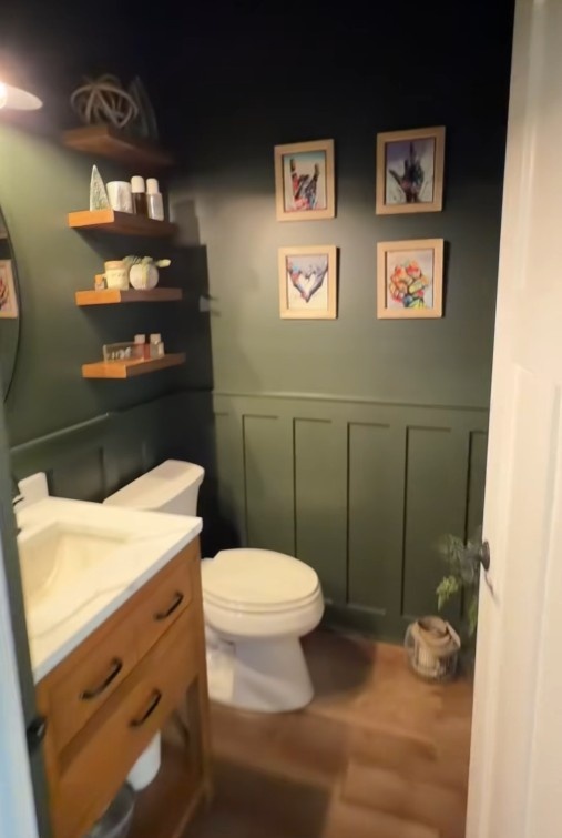
1. Cascades SW7623
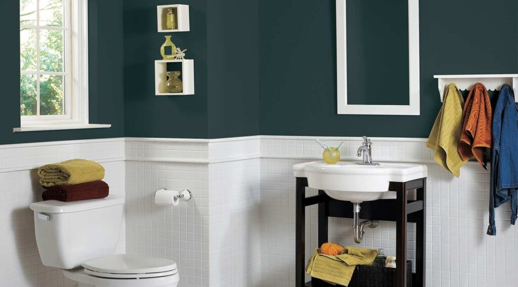
This color is a deep blue-green with serious spa energy. Not bright, not trendy, not loud. It’s the kind of shade that instantly makes a bathroom feel intentional, like it was designed—not just painted. I always describe Cascades as moody but soothing. You walk in and your shoulders just… drop.
In a master bath, Cascades works beautifully because bathrooms already have so many hard, light surfaces—white tile, porcelain, mirrors, chrome. This color balances all of that. It adds depth and warmth without making the space feel heavy. Even in a smaller bathroom, it can actually make the room feel more luxurious, almost cocoon-like, instead of cramped.
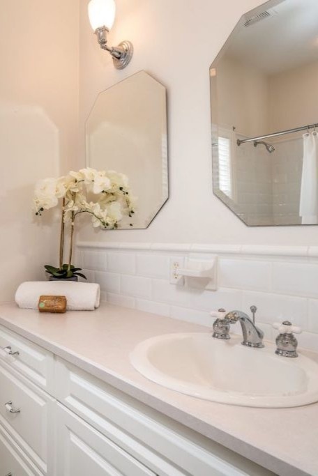
One thing I love about Cascades is how amazing it looks with classic bathroom finishes. Crisp white tile (like the one in your image), bright white trim, and simple fixtures really pop against it. Add warm towels, natural textures, or even a touch of brass, and suddenly your bathroom feels elevated without trying too hard.
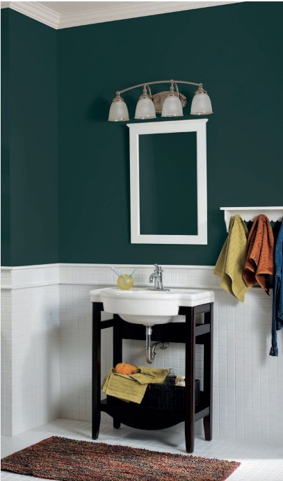
Lighting matters here, but in a good way. With natural light, Cascades feels fresh and grounded. At night, under soft lighting, it turns cozy and dramatic—perfect for winding down. That’s why it’s such a strong choice for a master bath, where you want both function and atmosphere.
2. Window Pane SW6210

This shade is that perfect soft blue-green that feels clean and relaxed at the same time. Not icy, not gray, not overly colorful. It’s the kind of color that makes a master bath feel like a quiet morning—sunlight coming in, everything feeling fresh, peaceful, and put together.
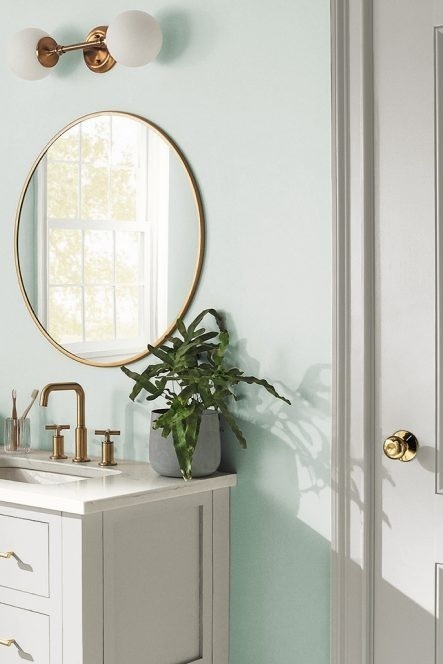
I especially love Window Pane in a master bath because it plays so nicely with natural light. In a space like the one you’re working with—white tile, lots of windows, clean lines—it just works. The color gently reflects light around the room, making the bathroom feel brighter and more open without feeling stark or cold.
From a designer’s point of view, this is a very easy color to live with. It pairs beautifully with white marble, soft gray veining, chrome or brushed nickel fixtures, and even warmer elements like woven shades or wood accents. You can lean classic spa, coastal, or slightly traditional and Window Pane still fits right in.
Another reason I love it for a master bath? It won’t fight with your finishes. Your tub, tile, counters, and towels all get to shine, while the wall color quietly pulls everything together. If you want that hotel-but-comfortable feeling, this shade absolutely delivers.
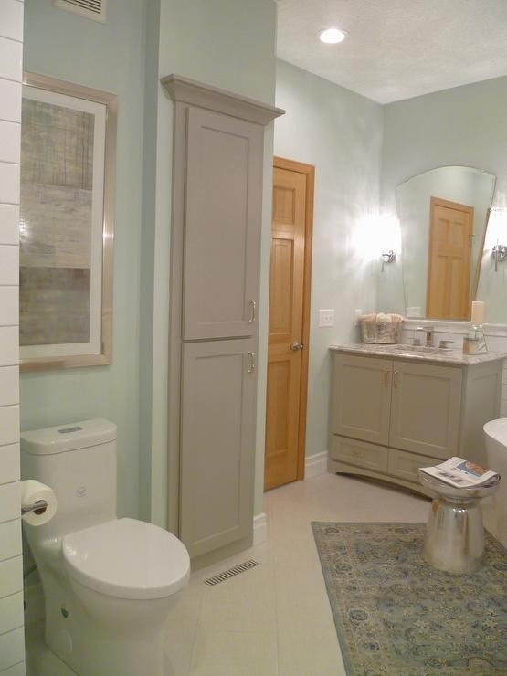
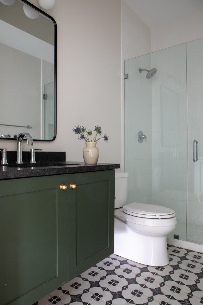
3. Rock Garden SW6195
Rock Garden is a muted, earthy green with soft gray undertones. It’s not bright or trendy, and that’s exactly why I love it. It feels grounded, natural, and very grown-up. This is the kind of color that makes a master bath feel intentional and serene, like a quiet retreat rather than just another bathroom.
What really makes Rock Garden shine in a master bath is how well it balances warmth and softness. Bathrooms can easily feel cold with all the tile, stone, and porcelain, but this color warms everything up without going yellow or muddy. It’s calming in the morning and relaxing at night—which is exactly what you want in a space you use every day.
In a setup like the one shown—white vanity, clean countertops, simple fixtures—Rock Garden adds just enough contrast to keep things interesting. It looks amazing with matte black hardware, brushed brass, or even polished nickel. Add a round mirror, a little greenery, and soft lighting, and suddenly the bathroom feels styled but still livable.

Designer tip: this color pairs beautifully with natural textures. Think wood accents, woven baskets, linen towels, or stone finishes. It leans spa-like without going full “zen retreat,” which makes it perfect for a master bath that connects to a bedroom.
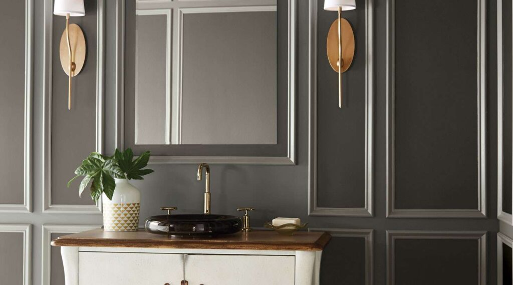
4. Inkwell SW6992

Inkwell is a deep, inky black with subtle blue undertones, and it is stunning when done right. I know black in a bathroom sounds intimidating, but hear me out. In a master bath, this color feels luxurious, intentional, and very high-end—like a boutique hotel you’d never want to leave.
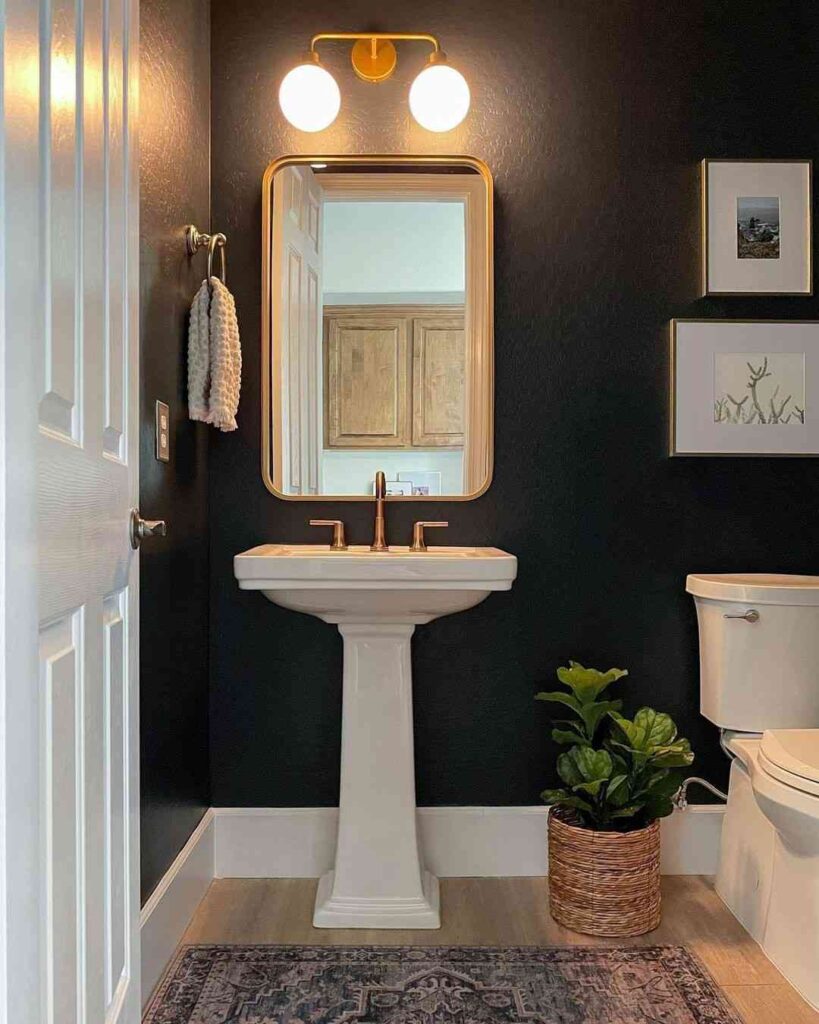
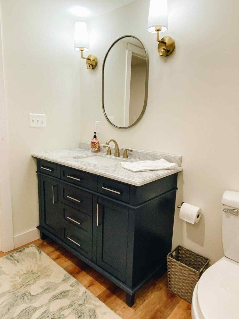
What I love about Inkwell is how it instantly elevates the space. Against white vanities, marble or granite countertops, and clean fixtures (like in the image you’re working with), it creates contrast that feels crisp and modern, not dark or gloomy. The walls almost disappear, letting the textures and finishes really shine.
Lighting is key here, and when you have it—even just a good mirror and layered lighting—Inkwell feels cozy and sophisticated rather than heavy. It’s especially gorgeous in a master bath where you want a moody, calming vibe at night. Think spa-meets-modern-luxury.
Designer tip: keep the balance. Pair Inkwell with plenty of white, light stone, or warm wood tones. Matte black or brushed brass hardware looks incredible with this shade, and a touch of greenery softens the look perfectly.
5. Greek Villa SW7551
Greek Villa is a warm white, and that warmth is the key. It’s not icy or gray, and it doesn’t feel yellow either. In a master bath, it creates that soft, clean look everyone wants, but with a cozy, welcoming undertone that makes the space feel lived-in and relaxed instead of sterile.
What I love about Greek Villa in a bathroom is how it works with everything. Tile, stone, marble, glass, chrome, matte black, brushed nickel—you name it. In a modern space like the one shown, it lets the darker elements (like cabinetry or tile) stand out while keeping the room feeling open and airy. The light just bounces beautifully off the walls.
This is also an amazing choice if your master bath doesn’t get a ton of natural light. Greek Villa reflects light in a soft way, so the room feels brighter without looking harsh. It’s perfect if you want that spa-like, hotel-bathroom vibe that still feels warm and comfortable first thing in the morning.
Designer tip: pair Greek Villa with layered textures. Think plush white towels, soft rugs, natural wood accents, or subtle stone finishes. Even bold, darker colors nearby feel more balanced when this shade is on the walls.
6. Anchors Aweigh SW9179, Adriatic Sea SW6790, and Extra White SW7006

Let’s start with Anchors Aweigh. This is a deep, confident navy—rich, classic, and timeless. I love using it on bathroom walls because it instantly makes the space feel polished and intentional. It’s bold, yes, but not trendy-bold. More like “this bathroom was designed by someone who knows what they’re doing” bold. In a master bath, it brings that upscale, boutique-hotel vibe without feeling cold.

Now, Adriatic Sea is where the fun comes in. This color is vibrant, energetic, and full of life. I usually recommend it for a vanity or accent area, like you see here. It keeps the space from feeling too serious and adds a fresh, modern contrast against the darker navy. It’s perfect if you want color but don’t want the whole bathroom to feel heavy.
And then there’s Extra White—the unsung hero. This crisp, clean white is what makes everything work. It brightens the room, balances the darker blues, and keeps the bathroom feeling open and fresh. I love it for trim, beadboard, tile areas, or even ceilings. It gives your eye a place to rest and makes the colors feel intentional instead of overwhelming.
From a designer’s perspective, this trio is ideal for a master bath because it hits all the right notes: depth, brightness, and personality. The blues feel calm and spa-like, while the white keeps things light and timeless. Add brass or gold fixtures, simple mirrors, and soft lighting, and the whole space just clicks.
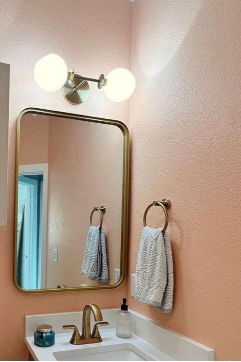
7. Exuberant Pink SW6840
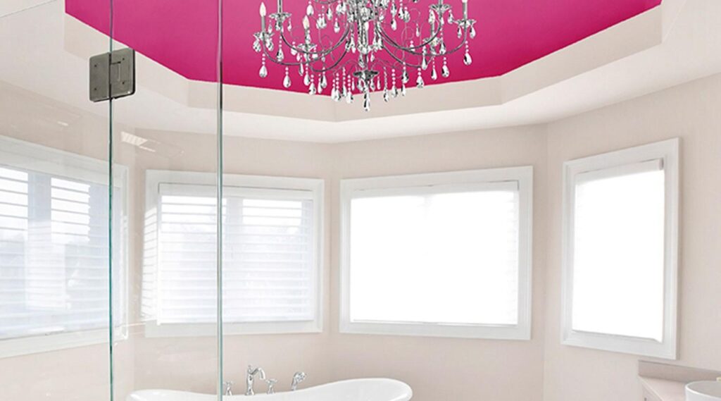
This is not a shy pink. It’s bold, playful, and full of personality. But when it’s used thoughtfully—like on a ceiling, an accent wall, or a tray ceiling like the one you see here—it feels chic and intentional, not overwhelming. As a designer, I love recommending this color to friends who are tired of safe neutrals and want their master bath to actually feel fun.
What makes Exuberant Pink work in a master bath is balance. Paired with soft neutral walls, lots of natural light, and crisp white trim, it becomes a statement instead of a shock. In this space, the pink ceiling draws your eye up and adds a little glam—especially with that chandelier—without taking over the whole room.
Bathrooms are actually a great place to play with color because you don’t spend all day there. That makes a bold shade like Exuberant Pink feel exciting rather than exhausting. It brings energy in the morning and personality at night, which is perfect for a master bath that’s meant to feel personal and a little indulgent.
Designer tip: keep the rest of the palette calm and elegant. Think creamy whites, soft taupes, marble, and polished chrome or crystal accents. The contrast lets the pink shine while keeping the space sophisticated—not juvenile or trendy.
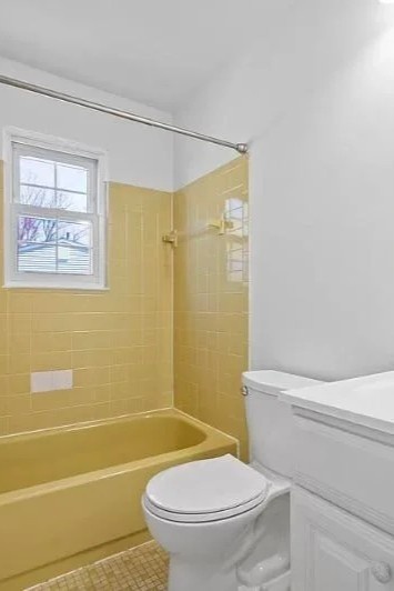
8. Daisy SW6910
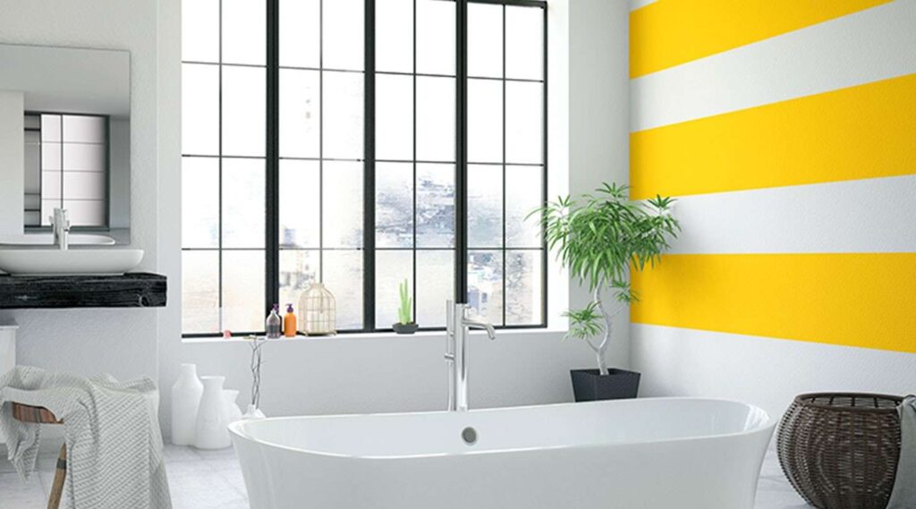
Now, before you panic about yellow in a master bath, hear me out. Daisy isn’t muddy or dull. It’s bright, cheerful, and confident. When used the right way—like an accent wall, stripes, or a feature area like you see here—it brings energy and personality without overwhelming the space.
As a designer, I love Daisy for master baths that get good natural light. The color plays beautifully with sunlight and instantly makes the room feel more alive. It’s especially great if your bathroom leans modern or minimal, because the pop of yellow keeps it from feeling cold or boring.
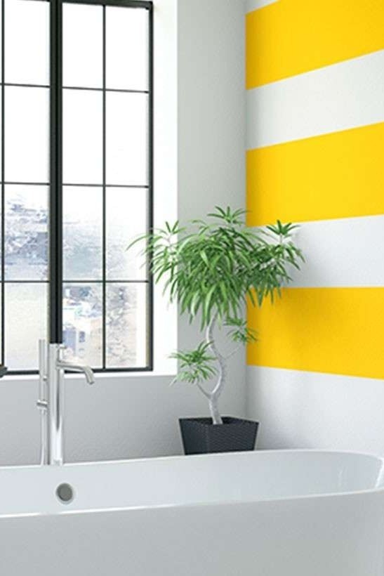
The key to making Daisy work is balance. Pair it with lots of white—white tubs, white walls, white tile—and suddenly the yellow feels crisp and intentional, not loud. Black window frames, simple fixtures, and natural textures like woven baskets or plants ground the color and keep it feeling elevated instead of playful-for-the-sake-of-it.
Bathrooms are actually one of my favorite places to use bold colors like this. You don’t need them to feel “neutral” all day long. A master bath can be energizing in the morning and still feel clean and relaxing at night when the rest of the palette stays calm.
9. Double Latte SW9108, Garden Spot SW6432, and Black Magic SW6991
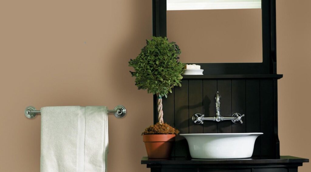
Let’s start with Double Latte, because this color is the foundation. It’s a rich, cozy neutral—think warm beige with depth, not flat or boring. In a master bath, it instantly makes the space feel calm and welcoming. I love it when clients want something softer than gray but still timeless. It’s the kind of color that wraps the room in warmth, especially when paired with darker accents.
Now, Garden Spot is where things get interesting. This is a fresh, leafy green that brings life into the space without screaming “color.” Used on an accent wall, cabinetry, or even just subtly layered through decor, it adds that natural, spa-inspired feel. I’m a big fan of greens in master baths because they feel restorative, and Garden Spot does that beautifully.
And then there’s Black Magic—the anchor. This deep, true black is perfect for grounding the whole look. I wouldn’t necessarily paint every wall with it, but as a vanity color, trim, mirror frame, or feature wall, it adds instant sophistication. In a master bath, Black Magic makes everything around it feel more intentional and high-end.
What I love about this palette is how balanced it feels. Double Latte keeps things warm and livable, Garden Spot adds freshness, and Black Magic brings contrast and drama. Together, they create a master bath that feels earthy, elegant, and thoughtfully designed—not trendy or overdone.
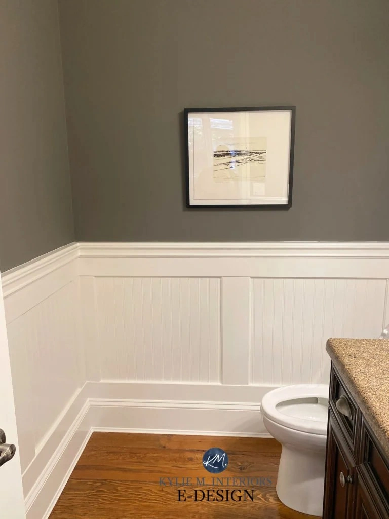
10. Rhinestone SW7656, Gray Clouds SW7658, and Cajun Red SW0008
Let’s start with Rhinestone. This is one of my go-to soft grays for bathrooms. It’s light, clean, and slightly cool, which makes it perfect for upper walls, trim-adjacent areas, or spaces with lots of molding like this one. It keeps everything feeling bright and fresh without going stark white.
Gray Clouds is the perfect supporting color here. It’s a touch deeper and warmer than Rhinestone, which makes it ideal for wainscoting or lower walls. I love this approach in a master bath because it adds depth and structure without overwhelming the space. It feels tailored, calm, and very timeless—especially paired with classic millwork.
Now, Cajun Red is where the personality comes in. You don’t need much of it, and honestly, that’s the beauty of it. Used through towels, accessories, or a small accent area, it adds warmth and richness to an otherwise neutral space. It keeps the bathroom from feeling too quiet or cold and ties in beautifully with wood vanities or traditional details.
As a designer, I love this palette for a master bath because it feels balanced. The grays are soothing and spa-like, while Cajun Red adds that subtle, confident pop that makes the space feel personal. It’s especially great if you like classic design but still want a little warmth and character.
11. Extra White SW7006, On the Rocks SW7671, and Alabaster SW7008
Let’s start with Extra White. This is that crisp, clean white that makes everything feel fresh and intentional. I love using it on trim, ceilings, or cabinetry because it keeps the space feeling bright and modern. In a master bath, Extra White reflects light beautifully and gives the whole room that clean-hotel-bathroom feel.
On the Rocks is the soft neutral that ties everything together. It’s a light greige with just enough warmth to keep it from feeling cold. I often recommend it for wainscoting, lower walls, or even the main wall color if you want something subtle but not plain. It adds quiet depth without competing with tile, fixtures, or natural light.
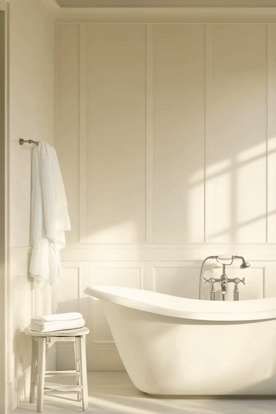
And then there’s Alabaster—one of my all-time favorite warm whites. This color is perfect for upper walls or larger areas because it feels soft, calm, and welcoming. It’s not stark, not yellow, just gently warm. In a master bath, Alabaster makes the space feel relaxed and elegant, especially paired with a classic tub and simple fixtures like you see here.
What I love about this palette is how effortless it feels. Nothing is trying too hard. The colors flow naturally, making the bathroom feel cohesive and calm—exactly what you want in a master bath you’ll use every single day.
12. Gauntlet Gray SW7019, Black Fox SW7020, Dovetail SW7018, and Relic Bronze SW6132
Let’s start with Gauntlet Gray. This color is bold without being harsh. It’s a deep gray with warm undertones that make it perfect for a master bath. I love it on walls with paneling or molding because it adds instant depth and makes the space feel tailored and intentional. It’s moody, but still very livable.
Dovetail is the softer sibling in this group. It’s slightly lighter and a bit warmer, which makes it a great option if you want contrast without going too dark. I often use it on adjacent walls or cabinetry to keep the space layered and interesting while still feeling cohesive.
Now, Black Fox—this is where the drama really shows up. It’s a deep brown-black that feels incredibly rich. I don’t usually recommend it for every wall in a bathroom, but as an accent, vanity color, or feature area, it’s stunning. It grounds the space and makes everything around it feel more high-end.
And then there’s Relic Bronze, which quietly ties everything together. This warm bronze tone adds just enough softness and warmth to balance out the darker grays. It works beautifully in bathrooms with brass fixtures, warm wood, or vintage-inspired details. Think of it as the color that keeps the whole palette from feeling too cool or heavy.
As a designer, I love this combination for a master bath because it feels sophisticated and calming at the same time. Paired with warm metals, soft lighting, and simple styling, these colors turn a bathroom into a true retreat—something that feels elegant in the evening and cozy in the morning.
13. Loggia SW7506, Shoji White SW7042, Extra White SW7006, Uncertain Gray SW6234, Moderate White SW6140, and Westhighland White SW7566

Let’s start with Loggia SW 7506, because this one sets the mood. Loggia is a warm greige with just enough depth to make a master bath feel cozy and elevated. I love it on main walls, especially in bathrooms with a freestanding tub or classic details. It feels relaxed and elegant at the same time—very “slow morning, spa-at-home” energy.
Now, Shoji White SW 7042 is that soft, creamy neutral that plays so nicely with Loggia. It’s warmer than a true white but still bright, which makes it perfect for upper walls, trim-adjacent areas, or anywhere you want lightness without stark contrast. Shoji White is one of those colors that just makes everything around it look better.

Extra White SW 7006 is your crisp accent here. I like using it for ceilings, trim, or cabinetry when you want clean definition. In a master bath, it keeps the space feeling fresh and polished, especially when paired with softer wall colors like Loggia or Moderate White.
Speaking of Moderate White SW 6140, this is a beautiful in-between shade. It’s warmer and softer than a true white, with a subtle beige undertone that feels very calming. I often suggest it if you want a monochromatic look that still has depth—perfect for bathrooms where you don’t want strong contrast but still want interest.

Uncertain Gray SW 6234 is great if you want just a hint of coolness. It’s a light gray with soft blue undertones that feels clean and airy, especially in bathrooms with lots of natural light. I love it for balancing out all the warm whites so the space doesn’t lean too creamy.
And finally, Westhighland White SW 7566—this one is a classic. It’s warm, soft, and incredibly forgiving in a bathroom setting. It works beautifully on walls, especially if you want that traditional, timeless master bath look that never feels dated.
What I love about this whole palette is how flexible it is. You can mix and match depending on your layout—warmer tones near the tub for a cozy feel, crisper whites for trim and ceilings, and soft grays to add quiet contrast. Everything flows, nothing fights for attention.
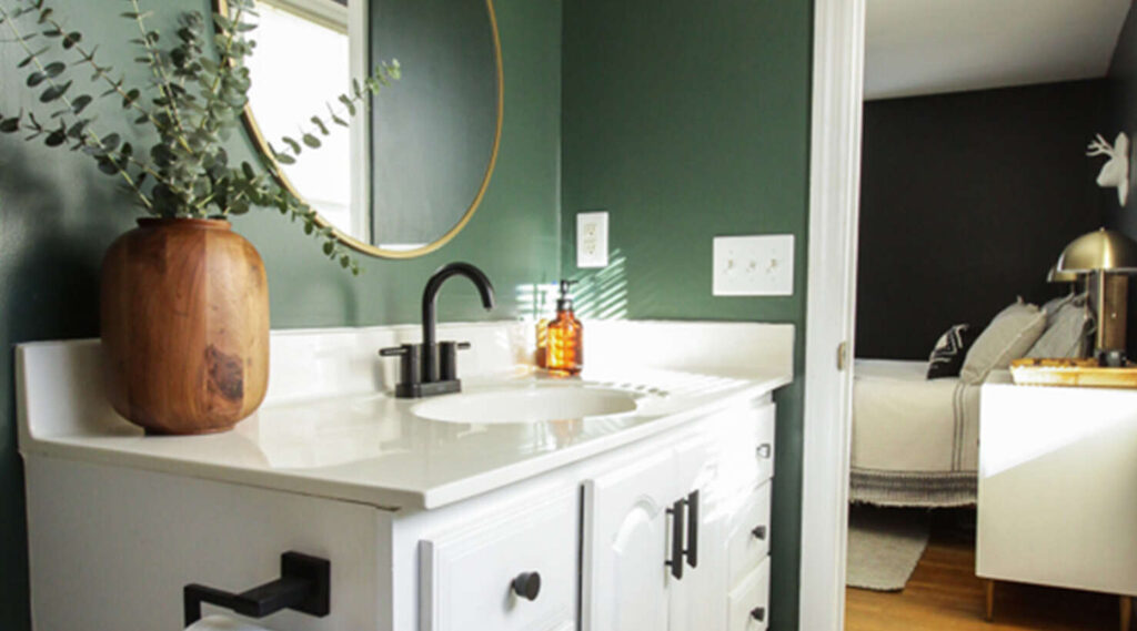
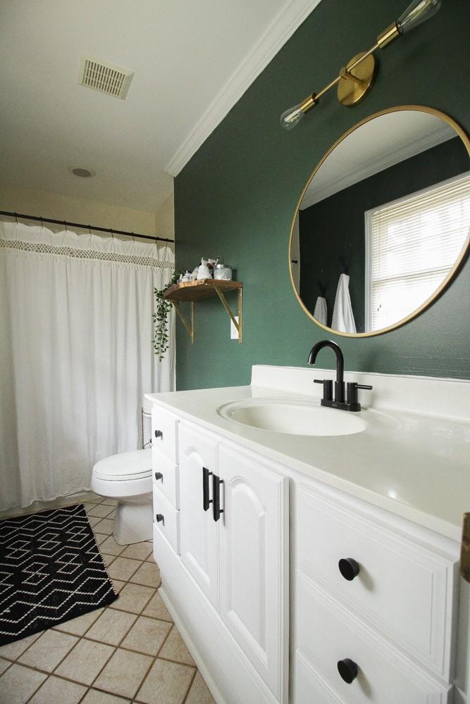
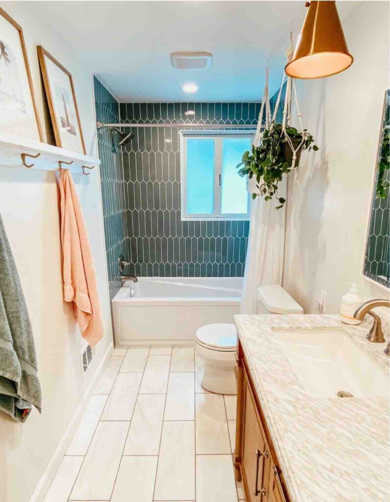
14. Ripe Olive SW6209

This color is a deep, moody green with warm undertones that instantly makes a bathroom feel grounded and sophisticated. It’s bold, but not flashy. I love recommending Ripe Olive to friends who want their master bath to feel like a real retreat—calm, cozy, and a little luxurious without being over-the-top.
In a space like this, with crisp white tile and clean lines, Ripe Olive creates beautiful contrast. The white fixtures pop, the greenery feels intentional (not just decorative), and the whole room gets that high-end, spa-inspired vibe. It’s especially gorgeous in bathrooms with natural light, where the color shifts subtly throughout the day.
Designer tip: balance is everything with a color this deep. Pair Ripe Olive with warm whites, light wood accents, and simple metals like black or brushed brass. It keeps the space from feeling too dark while still letting the color do its thing. Even something as simple as white towels or a light vanity makes this shade feel fresh instead of heavy.
Another reason I love Ripe Olive in a master bath is how timeless it feels. It doesn’t chase trends. It feels connected to nature, which means you’re much less likely to get tired of it a few years down the line. That’s always a win in a space you use every single day.
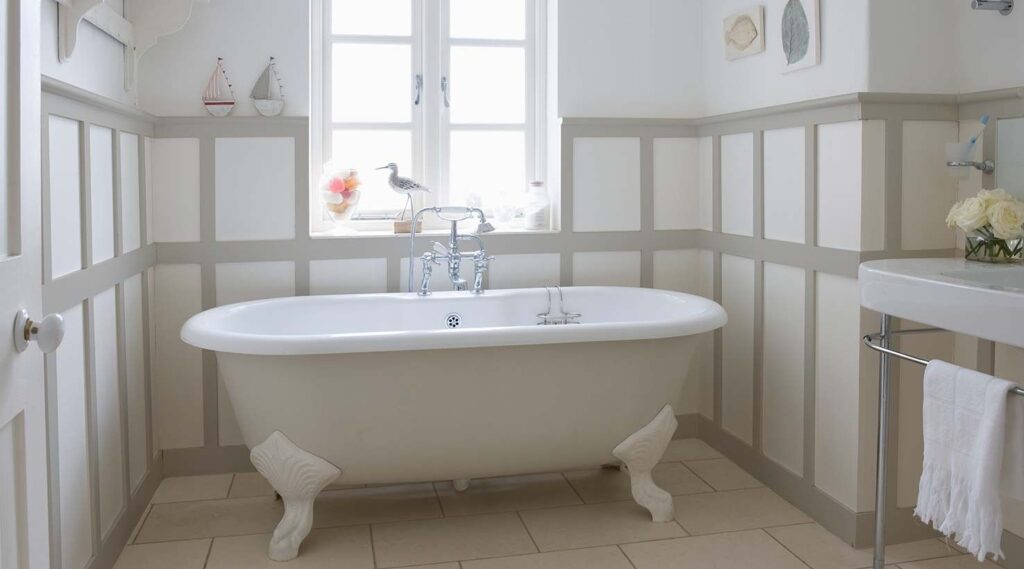
15. Alabaster SW7008

Think of Alabaster as the perfect warm white. It’s not stark, it’s not yellow, and it definitely doesn’t feel cold. In a master bath, it creates this soft, calm backdrop that instantly makes the space feel clean, relaxed, and a little bit elevated—like a really good hotel bathroom you never want to leave.
What I love most about Alabaster is how forgiving it is. Bathrooms have a lot going on—tile, mirrors, lighting, stone, wood—and this color just works with all of it. In a space like the one shown here, Alabaster lets the natural wood vanity, black fixtures, and greenery really shine without competing for attention.
From a designer’s perspective, this is a dream color if you want your master bath to feel bright but still cozy. It reflects light beautifully, which helps the space feel larger and more open, especially if your bathroom doesn’t get tons of natural light. Morning light looks soft and fresh, and at night it feels warm and calming.

Alabaster is also incredibly versatile. You can lean modern, farmhouse, spa-like, or classic, and it still fits. Pair it with matte black for contrast, brass for warmth, or chrome for a crisp look—it adapts effortlessly.
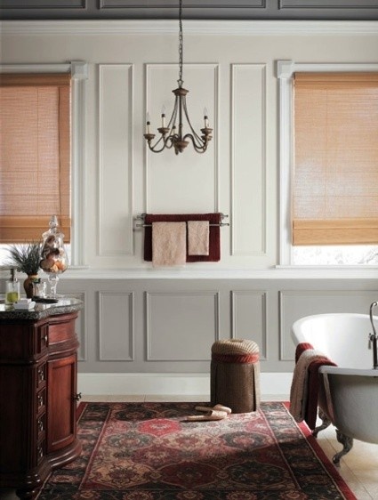
16. Poised Taupe SW6039
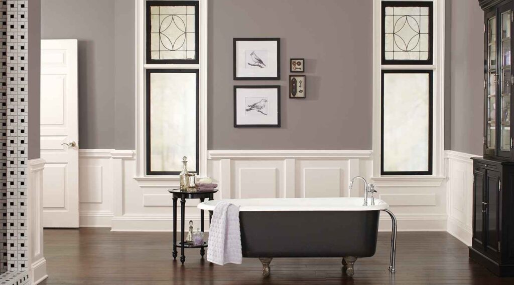
Poised Taupe sits in that sweet spot between gray and beige, which is exactly why it works so well in a master bath. It has warmth, but it’s not heavy. It has depth, but it doesn’t darken the room. The result is a space that feels grounded, sophisticated, and incredibly easy to live with.

In a bathroom like this one, with classic paneling, a statement tub, and crisp white trim, Poised Taupe creates the perfect backdrop. It lets architectural details shine while adding enough contrast that the room doesn’t feel flat or washed out. I love how it pairs with black accents, white fixtures, and darker wood—it feels timeless, not trendy.

From a designer’s point of view, this is a great choice if you’re nervous about going too light or too dark. Poised Taupe adapts beautifully to different lighting, looking soft and warm during the day and cozy and refined at night. That’s a big win in a master bath, where lighting changes throughout the day.
It’s also incredibly versatile. You can lean traditional, modern, or even slightly moody, and Poised Taupe still fits right in. Add brushed nickel for a classic look, brass for warmth, or matte black for contrast—it plays well with all of it.
Read Also: 15 Most Popular Sherwin Williams Master Bedroom Paint Colors That Are Timeless and Relaxing